Tuesday, April 26, 2016

A Reflection on Digital Conveniences

It’s already the end of my semester. I’ve learned a ton of things in my course on digital portfolios which I will be sure to bring with me. The main thing I’ve learned is that blogging in this manner is something I find mentally draining. Instead, I would prefer a blog with more pictures than words like an art blog, which I’m thinking about starting once I’m more confident in my skills. This last blog will discuss my progress and reflect on the things I have learned.
Firstly, I learned how to build a personal learning network (PLN) from my class. It’s an idea that many people are actually unconsciously building. Or then could be like me and be completely oblivious to it and try to steer clear of any sort of social media. The simple act of following professionals in your field of interest and communicating with them serves to build a solid PLN; this is something I have been trying to do over these past few months. How’s my progress? Extremely poor. I’ve only followed 18 people or groups on Twitter, but a start is a start. Using Twitter in this way has helped me build my knowledge on illustration, so I’m planning on continuing to build my PLN.

During these few months I have been exposed to digital tools that I never would have thought existed. Honestly I don’t think I’ll be using the majority of them, but just knowing they exist can make my life a lot easier at times. The tools I absolutely want to be using are:

Prezi: This presentation tool looks much more professional than Microsoft PowerPoint in my option. The transition between slides feels much more fluid, and it’s just more engaging overall. Learning the basics took all of five minutes of tutorials and three minutes of tinkering.


Paper.li: This tool automatically pulls stories from your field of interest. I personally find this helpful because all the information is brought to me. I’m quite a fan of doing less while gaining more. It’s convenient. More information here.


Where to Go?: An amazingly simple, but helpful app for finding places around your area. It uses gps to guide you to restaurants, hotels, hospitals, and more. I consider myself horrible with directions, meaning this app is my light house.


Lastly, I’ve learned the importance of creating a website; this is especially important for aspiring illustrators in the digital age because it allows anyone to view your artwork. In other words, it’s exposure. By posting artwork on the internet, you’re opening yourself up to a giant audience. Unfortunately, I’m still in the process of building my site, but I find that this is definitely something I’ll be taking with me when I move on from college.


I’ve learned much more than I mentioned here, but that would make for a lengthy blog so I’ll end it there. I definitely want to continue to use social media as a means of learning, so I will be on the lookout for helpful new tools, sites, articles, and whatnot. I hope you enjoyed this blog and thanks for reading.

Tuesday, April 19, 2016

Utilizing Social Media Connections

Last week I had the opportunity to sit in on a talk with Robyn Hrivnatz, a marketing and educator programs manager at Microsoft. The talk primarily consisted of the topic of using social media as a professional. By now I probably sound like a broken record, however I personally manage to find new and interesting information on this topic. One of the important points Hrivnatz mentions is using social media to find out what your competition is doing. I always like to remember Sun Tzu in situations like this with his famous “know your enemy” quote. It’s kinda hard to put copyright on a tactic, right? If you find yourself lacking options, may be “borrowing” some of their ideas might not be a bad idea. 


On the flip side, social media can also be used to communicate and connect with the group giving you the most direct feedback on your work: customers. Whether or not something is working in your company can be quickly found by customers. They serve as the audience that you have to understand.
Hrivnatz also briefly mentions some helpful tips about LinkedIn. This site is one of the most professional social media sites out there, which i’m sure many people know. Linkedin provides users with digital profiles which can act as a resume in many cases, however Hrivnatz believes this is an extremely poor way to portray yourself. By turning your profile into a resume, you lose what little information you can provide about your personality. Instead, she suggests to let your profile be a summary of your strengths and your private and professional life; this way a personality is built.

On a loosely related note, Sheyl Nussbaum-Beach discusses the four core components of learning in the final chapter of her Connected Educator. The components are as follows:
Knowledge - Due to being able to access a plethora of information through the web, it’s impossible to take in all knowledge. Instead, Nussbaum-Beach suggests creating a connection of minds that are able to branch out to different sources of knowledge.

Pedagogy- This one applies more for teachers. Instead of being a students only teacher, they will show and encourage students to create their own learning connections.

Connections -This is where innovation really begins to show. Connected groups experiment, brainstorm, discuss, reach out to professionals, and analyze the subject of their passion.

Capacity - essentially, by building a connection, people are able to broaden their perspectives and keep an open-mind; this allows for curiosity, exploration, and ultimately discovery. People are simply more independent and can learn at their own pace.

Tuesday, April 5, 2016

Conveniences of Social Networking

This week, I discovered an interesting app that allowed me to schedule reminders or just automatically handle tasks that I would label as a hassle. IFTTT is an amazing app that can tie together two unrelated devices. Users can create recipes that cause one device to trigger a response from another. Why is this useful? Well, you can decide for yourself after checking out these few helpful recipes, including:

Social Notifications: Connecting your smart lights to any social media and allowing that to help notify you whenever there’s an update.

Weather: When weather conditions change, linking weather apps can help notify you of temperature or just bad weather. It’s pretty convenient.

Light switches: I personally find this the most helpful. You are able to link your lights at home to your car, meaning there will be less instances where you waste electricity.

Another helpful app that I have recently decided to use again is Pinterest, a well-organized social bookmarking site. This site covers many fields of interests, and it just so happens that it’s perfect for illustrators. I can find many great art tutorials, inspirational images, or just reference images for poses and such. Users have boards which they pin bookmarks to, these can be from mostly anywhere on the web. If a user decides that they would like their board to gain popularity, be helpful, and help them build connections, there are many methods to help them do so, such as:

Keywords: Something as simple as this can make navigating to your board much easier for others.
Avoid spam: This is common sense, however many people can forget that tons of pins at once can cause inconvenience for your followers. Don’t be surprised if you lose quite a bit in this case.
Organization: I definitely stress this as one of the most important methods. I personally loathe poorly constructed, illegible, and ugly pages.
New pins: rather than simply repinning (like me), it’s important to introduce pins that people have never seen before; it’s simply more eye-catching.

Moving on, my professor recently presented great information about the bio page of a website. The page is generally known as the “About Me” page. Unfortunately, I talk very little about myself, which means my bio page is generally… let’s say one sentence or less. Informative? Very much so. I now realize however, that this page can be used as a mini-portfolio. The “About Me” page is the perfect way to portray one’s personality, background, and provide visitors with a means to contact you. Doesn’t that sound like a business card? Next, you can provide a photo that can further emphasize your personality because it’s easy to judge a book by its cover when given little information. It’s time to work that in your favor. For more information, check out this article.

Lastly, I would like to touch on a few social networking tools mentioned in Untangling the Web. The authors, Steve Dembo and Adam Bellow, firmly believe that social media is a great way to connect with people despite all the interaction being digital. Rather than replacing real life meetings, it can allow for people to create a chance to expand on personal meetings through the internet. It’s a great point, but what of the socially awkward people? Whether they communicate online or offline, they’re still awkward. I believe one main cause of this is the lack of face-to-face interaction. When they suddenly have access to a large, expanding digital community, how are they able to use these digital connections to further their personal connections? Just a thought. Anyway, Dembo and Bellow introduce extremely useful tools that aid in digital communication:
TodaysMeet: The app essentially allows users to create a room that can be used for discussion. In an educational environment, this allows students and teachers to freely discuss issues without time restraints. Students are also able to discuss problems with each other, creating an ideal, out-of-class learning environment. Since everything is digital, it’s much easier for the shy students to speak up. Students can help each other or just consult with the teacher and receive an answer that benefits the entire class.

Skype: This extremely popular app was considered taboo in my high school; students were banned from using it, and those who did received a polite invitation to the principle’s office. The main advantage of Skype is the video chat feature. How can this be used in classrooms? Students can simply connect with other students from all over the world. I can see language courses benefiting tremendously from Skype. The app now contains a feature specifically designed for education. Teachers are able to connect with professionals using designated Skype lessons, which essentially allows students to have professional contact before stepping into the real world. This feature is definitely revolutionary to education and should see an increase in usage when more educators realize its significance.   

Tuesday, March 29, 2016

Digital Reputation

This uneventful week I learned two main things; social media can ruin careers and the idea of time does not exist in a studio. It’s pretty easier to get lost in the work in a studio. However, I would like to talk more about social media because one mistake could ruin one’s entire reputation. For example, a few that I researched and heard about include; Ashley Payne, a teacher fired over an unprofessional picture of her holding alcohol; a teacher who had joked about drowning her students, and then was fired because the principle found out; Ayumi Kuroiwa (my personal favorite), who was fired for uploading NSFW artwork on her private Twitter. There’s an ongoing list of people who ruin their careers. It frightens me how easy it is to create a bad reputation; I like to think of it as walking through a field of landmines where some are obvious and others are extremely obscure.
I personally decided to research Ayumi Kuroiwa, mainly because she is related to my field of interest. Kuroiwa is an animator that has participated in many notable projects such as Haikyuu and Kuroko no Basket. She had been posting not safe for work (NSFW) art on her private Twitter along with complaints about her company and some of their projects. She had been asking repeatedly to stop posting fan art but still continued to do so. Eventually, the company decided to fire her and ask for her account to be terminated. Some fans believed that Kuroiwa’s treatment was unethical and that posting fan art should not affect her career. Unfortunately, an employee, whether on or off work, can still behave in a way that reflects poorly on the company. It’s completely understandable that they would want to fire her.
This leads me to a chapter of Sheryl Nussbaum-beach’s Connected Education focusing on managing online reputation. Many users fail to realize that their actions on social media can easily be found if googled. Sheryl stresses the importance of building a digital footprint in a way that is transparent, safe, and most importantly positive. It’s very difficult to land a job when the first thing an employer googles about you is an article about your dismissal from your last job, like the case with Kuroiwa. Statistic show that almost half of all internet users have googled themselves, and that the well educated and wealthy google themselves the most. It definitely makes sense because the wealthy must maintain a good, professional reputation in order to protect their social lives, connections, and wealth; the same goes for the educated. Sheryl also provides tips on how to improve your reputation, such as:

Creating a professional webpage: This is extremely important because it can act as a mini-resume. It can give your background and, in my case, serve as a portfolio.

Tracking: Like I mentioned earlier, constantly monitoring your presence online can help you keep proper etiquette, or just give you an idea of how your reputation is looking.

Professional facade: Self-explanatory. It’s important to be aware of how your comments can affect others.

Social Media: keeping up multiple accounts can help broaden your footprint. You will show up in more searches.  

Tuesday, March 15, 2016

Augmented Reality in Apps

I was recently introduced to a load of useful apps against my will. It ended up being a pretty interesting experience. The uses for these apps ranged from everyday convenience, such as Where To Go?, to even professional use, like Camcard. An app that I personally find enjoyable is Adobe Sketch, which is a more convenient version of a sketchbook. It’s great for artists and hobbyists alike.

The other half of the app revolved mainly around the concept of augmented reality, which is defined as
“an enhanced image or environment as viewed on a screen or display, produced by overlaying computer-generated images, sounds, or other data on real-world environment.”

To sum it up, it’s cool and it’s the future. Drew Minock describes augmented reality as comparable to the paintings in Hogwarts. This concept has a great amount of potential. Remember those silly JumpStart or ClueFinder games? Take ClueFinders for example and imagine it as if you were actually part of the gang, solving problems and exploring as if you were actually there. If this were when I played them, I wouldn’t have stopped 15 minutes into the game.

So what else can we do with this? Well when you apply augmented reality to an app, you get something along the lines of ZooKazam. You know, abra kadabra alakazam? I thought it was funny. As long as users have a target, they can bring animals wherever they go. The app includes 40 animals and 10 dinosaurs. It doesn’t seem like much, but it’s possible to add more animals in the future. I personally don’t see many uses for this in art education, except maybe to help artists with still life drawings.


Lastly, the app I find most useful is the upcoming Presentation Hero. Aside from the lame name, I find this app has the potential to be the most useful one that I came across this past week. I say this because I stress the importance of presentation and public speaking. This skill is absolutely essential in life due to almost every field requiring some kind of verbal contact. The better talker you are, the easier it is to get on people’s good sides. Unfortunately I’m horrible at this, which is where Presentation Hero would come in handy. The app puts the viewer under the spotlight and transforms a mundane mirror, wall, or whatever you talk to into a crowded auditorium; it’s perfect practice for public speaking. However, the main downside is that the user knows everything is fake, resulting in less pressure. Nonetheless an extremely useful app.

Tuesday, March 8, 2016

Conveniences of Digital Storytelling

Remember Microsoft Powerpoint? Me too. It was extremely boring. Powerpoint was a convenient tool for presentation, however it was only useful for getting information across. Several cons include lack of appealing features, web access, and voice options. There’s more but today’s blog isn’t about powerpoint. Instead, I’ll be introducing better tools. Their features are much more conspicuous.
Firstly, I’d like to briefly mention Microsoft Office Mix. It’s pretty much everything Powerpoint should have been. Better options include screen recording and audio. You know what this means? There’s no need to talk in front of the class during presentations. This feature is great for shy students, or just people who hate talking. Furthermore, it’s possible to give presentations without ever moving to another location using the previous feature and the web feature. With that people are able to share their presentations digitally.
So I’m sure almost everyone would prefer watching 2d animations over powerpoints; Something like Pokemon, South Park, and Simpsons. Wouldn’t it be great to have the Simpsons present to you? I don’t think so because I’m personally not interesting in them, but the idea is great. GoAnimate makes all of this possible. Well, maybe not the Simpsons exactly. However, It’s possible to mimic them. GoAnimate is a website that allows users to create their own animations with little effort and skill and still look professional. Since the learning curve isn’t steep, it’s easy to pick up right away. The website includes voices for narration and characters, so there’s no need to use your own voice to narrate. Advanced users can create their own characters, hire their own voice actors, and create everything from scratch. It’s a great presentation tool and it’s much more entertaining than Powerpoint.
I have also played around on the site myself and came up with this. Pretty amusing.


Animoto is another presentation tool that excels at Powerpoint’s job. Animoto can produce seemingly professional videos. Videos are essentially one of the post powerful tools to get information across because who doesn’t watch videos? Good videos will teach much more than a simple Powerpoint presentation ever can. Users can select their format, include music, and add text to their videos. Nothing better than some nice music in the background while you’re focusing on a video. The most important thing is that videos can be shared through the web, much like Office Mix. I stress this because sharing presentations digitally is much more convenient. It’s easy to access anytime, anywhere, and you can educate a much larger pool of people.
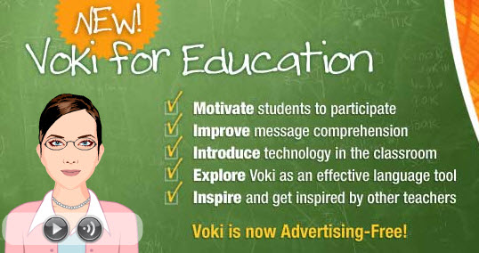
I also want to talk briefly about Voki. It’s not really a presentation tool, but Voki can be used for getting information across in a smaller environment. Users can create avatars that can be used in classroom environments as well as digital environments. For example, teachers can use Voki in classrooms to communicate with students in an entertaining manner using the voice recording option. Personally, I think it’s a pretty solid idea, however I actually believe this could be even more helpful for educating autistic children. SInce autism affects people’s social ability, autistic students would benefit from being able to communicate with educators through an avatar.

Lastly, I was given the opportunity to have Astronaut Abby come in as a guest speaking in my class. Abby is an aspiring astronaut with amazing networking skills at the young age of 18. She has connected with many professionals and manages group that educates people about space travel. Very impressive. On top of all that, Abby’s time management skills allow her to keep up with college work and other stressors that may plague her personal life. We were informed of tips for digital networking such as minimizing the types of social media we use to just those specific to our careers; stressing the importance of using Linkedin as a way to advertise your skills, experiences, and achievements; using social media (mainly twitter) as a means to connect with professionals in your field of interest. However, What stood out to me was the way our class connected with her. She didn’t have to physically come to the classroom just to give a talk. Instead, our professor was able to video chat with her and the entire interaction was done digitally. This is where the importance of digital communication and sharing comes into play. Presentations that allow digital sharing are able to reach out to a much larger audience in a shorter amount of time.  

Tuesday, March 1, 2016

Creativity in Education

What is the biggest flaw in the current education system? I firmly believe that it is the lack of creativity in education. Without creativity, schools are dull and lack innovative students. It’s like teaching a group of zombies; Do they care? Are they even thinking critically? Are they trying to apply knowledge to try forming their own hypothesis? Probably not, at least from my experience.I guess that isn’t very reliable.
I share the same sentiments as Ken Robinson who firmly believes that schools kill creativity. Robinson compares children who are imaginative and innovative to adults who are trained to be narrow-minded and formulaic. Children are much more spontaneous. They don’t fear being wrong and frankly they don’t even care about it because they’re too busy trying to enjoy themselves. As they grow older, they realize that if they follow certain thinking patterns and behaviors, they will fit in and avoid being wrong. I have no idea why being wrong is so taboo in society. By getting something wrong, people are able to learn to adapt, change their methods, and eventually come to a solution. Is that not learning? This is a topic Robinson makes a good point about. He claims that schools stigmatize being wrong, which causes students to fear it. Schools do all they can to help students avoid the wrong answers. This is essentially educating people out of creativity, which I believe to be an important point. Look at the current education system. What subjects are emphasized? STEM (science, technology, engineering, math). These are all industrial subjects that focus solely on academics and drop the arts. Unsurprisingly, the programs that are first in line to receive budget cuts are the arts. It’s a shame that creativity is undervalued.
Can you recall how it felt to be watching a presentation containing nothing but information and a picture every so often? Extremely boring. In all my life, the amount of interesting presentations I’ve seen can probably be counted on my fingers. From an audience’s point of view, this is horrible. It’s incredibly difficult to keep someone’s attention with a boring presentation. Of course it’s possible to claim that beautiful visuals and animation can be distracting, however at least the audience is looking at the screen. This doesn’t mean that every professor has to minor in graphic design, though it would be nice. Here are a few helpful presentation tools discussed in Untangling the Web By Stephen Dembo and Adam Bellow:

SlideShare:
Slideshare essentially lets you present without having to be there. People are able to publically upload presentations onto the web and allow others to have access. The fact that Slideshare is online means that sharing is extremely easy, meaning anyone who is familiar with social networking can use sites like Facebook to reach out to a larger audience. These features make it an extremely convenient tool for a classroom environment.


Prezi:
One of my favorite presentation tools. It truly pulls away from the boring traditions of dull slide-by-slide presentation. Prezi simply presents all the information on a single space. It is much easier to tie each topic to the main theme this way. The creative aspect is definitely what makes Prezi so appealing. It is possible to create appealing animations that relate to the theme while keeping the audience engaged and interested. For example, “projects related to global issues might zoom around a map of the world.” Prezi is not only appealing, but also user friendly, interactive, and can do most of what your traditional slide presentation can do (share links, embed videos, etc.).